Covid-19 has drawn many people’s attention to creating charts and graphs for data analysis and visualization. In the last month, I spent some time experiencing R studio and am impressed with its powerful statistic analysis package in every way, especially with their charting capability. The nice thing about it that you can also integrate with spatial analysis with the data. In this blog, I would like to share my practices with my county Covid-19 data using the animation of gganimate package.
Animation of data-driven story can naturally capture the interest of the readers and makes an impression. Creating animations with data can engage readers in ways other visualization tools may not be able to. With several easy to use R packages, making beautiful animation chart could be very simple.
Covid-19 Data in Cobb County
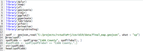
First, let’s bring in data. Cobb Covid-19 daily cases that you can download from Cobb and Douglas public health Covid-19 daily report website Covid-19 daily report. The spatial data is in geojson format with only polygons and no data. figure 1

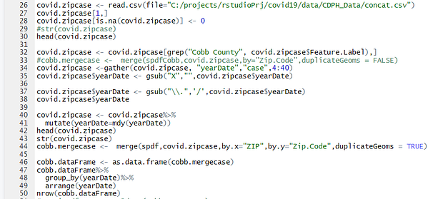
You can click the button on top to download daily report as a CSV file like form shows in figure 2. so you can join to spatial data with CSV.

Load required Library packages in R. With several lines of R code, you filter out just Cobb county spatial geojson

Now let’s format the date field to gather all date cases into one column yearDate with GATHER function and join with spatial data. The yearDate field will be used for animation series to save each frame into GIF. First to convert SF object to a data frame in order to feed into ggplot graph function.

Fun animations
Before you do animation, you should be carefully thinking which visualization changes you would bring in to engage readers. The most common type is the result of updated data in a series of dates.
This is the first ZIP code point animation from May 07- June 29 in Cobb:


The CSV contains a city column, you can animate city case by line graphs with R script like below.


This barchart is credited from Github resources that is generated the top 10 Covid-19 cases in Cobb from May 17 to June 29.

The last one, I experienced Animate ZIP code cases using map. Here we use (tmap) package. I should say this last one we don’t see a clear pattern so it may not be a good usage of map animation in this small geographic region.


My thinking
Animation is fun when you apply appropriate charts and graphs. And they engage readers in a way other visualization tools may not be able to. Now you can incorporate these tools into your presentations, websites, and blogs. The key point is to highlight meaningful changes in the data over the attribute which is driving the animation. Thanks so much for reading!

