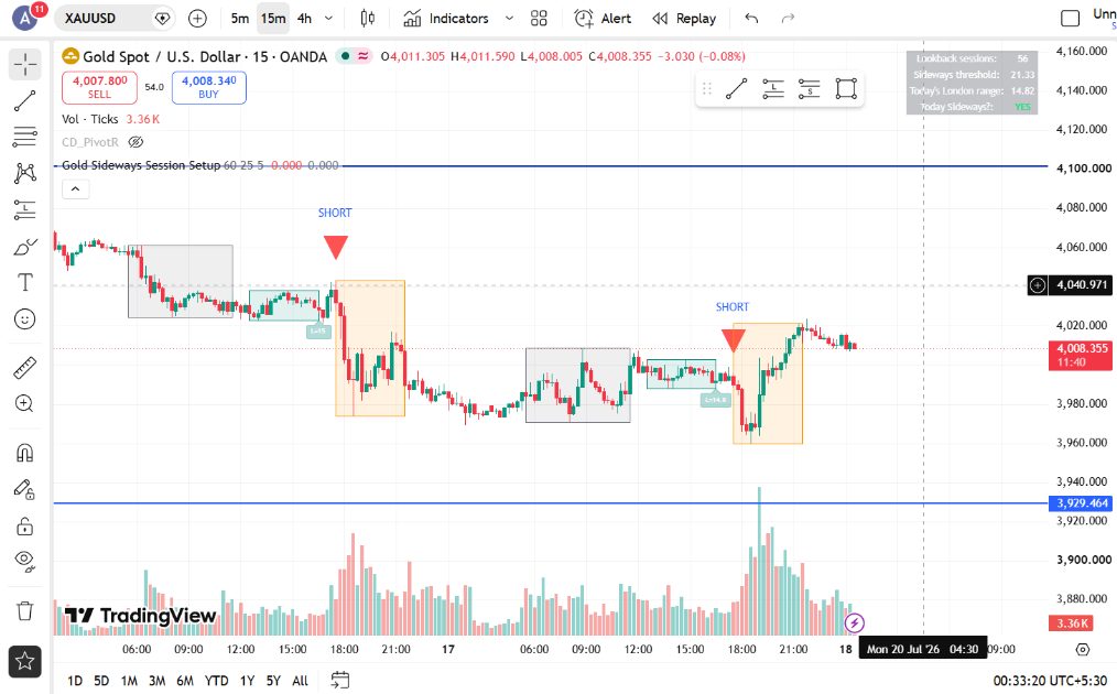
It started the way most trading ideas do — staring at a chart for too long.
If you find this insightful then please clap and comment your views
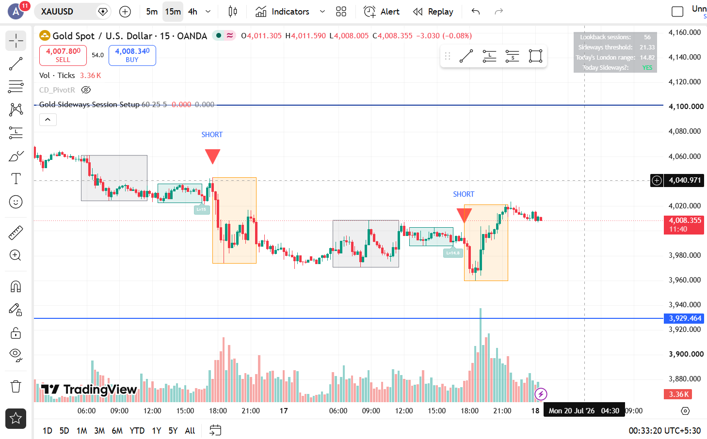
I noticed something on XAUUSD’s 15-minute chart: when the London session was bullish or sideways, the New York session would often drop 20–40 points afterward. When London was flat-out sideways, the New York drop seemed even sharper. I’d seen it enough times to think there might be something real here. But “I’ve seen it a few times” isn’t an edge — it’s a hunch. I needed to actually test it.
I know Python well enough to build this myself, and I’ve started backtesting workflows. I decided to use Claude as a thinking partner and pair-programmer to find out if what I was seeing was real, or just a story I was telling myself by staring at the same 50 candles too many times.
This is the honest account of that process — including the part where my original idea didn’t survive contact with data, and what we found instead.
Step 1: Defining the Idea Precisely
The first problem wasn’t code. It was that “London is bullish” doesn’t mean anything specific enough to test. Does it mean the session closed higher than it opened? More green candles than red? A particular shape?
We had to nail down:
Exact session times in UTC (London: 7:00–12:00, New York: 13:00–17:00)
What counts as “sideways” versus “directional” — and crucially, that this needed to be measured relative to the data, not as a fixed number, since gold’s typical session range changes across different volatility regimes
What “NY went down” actually means using only open, high, low, and close — since you can’t know the sequence of moves within a session from those four numbers alone
That last point took a surprising amount of back-and-forth. My first instinct was to measure direction using the session’s open versus its low. But that breaks immediately — if price sweeps up first and then drops hard, that calculation badly undercounts the real bearish move. We settled on a simpler, more honest measure: did the session’s range exceed a meaningful threshold, and did it close below where it opened. Imperfect, but transparent about what it does and doesn’t capture.
Step 2: Building the Pipeline
Before any pattern-hunting, we needed clean data:
Pulled 15-minute XAUUSD candles — first from a 4-year Kaggle dataset, later supplemented with a fresh 6-month export directly from MetaTrader 5 for the most recent period
Converted timestamps to UTC — broker data comes in MT5 server time, which shifts between UTC+2 and UTC+3 depending on the time of year. Getting this wrong would have silently mislabeled every session
Labeled every 15-minute candle by session — London, New York, Asian, or neither
Collapsed each day into one row showing what London did and what New York did
A genuinely important lesson here: I cross-checked the timezone conversion using my own session indicator’s source code rather than just trusting an assumption. That single step probably saved the entire analysis from being shifted by an hour and quietly wrong.
Step 3: The First Test — and the First Disappointment
With four years of data labeled and summarized, we ran the actual test: on days London was sideways or bullish, how often did New York drop?
The baseline rate of a New York bearish session, across all days, was about 19%. After a sideways-or-bullish London? Also about 18%. Statistically indistinguishable. Worse, when we ran the sanity check — what happens after a bearish London — the bearish-NY rate was actually higher than after sideways/bullish London. That’s the opposite of the original idea.
This is the point where most people either quietly stop testing or quietly stop believing the result. Neither felt right. What I’d seen on the chart was real screen time, not nothing — but four years of data said the pattern, as originally framed, wasn’t holding up.
Step 4: Following the Data Somewhere Else
Two things turned out to matter:
First, the dataset was stale. It ended in December 2025, and gold had been in a strong uptrend through most of that period. The “bearish market” I was watching live didn’t exist anywhere in that dataset — it only showed up after gold topped out in late January 2026 and rolled into a real downtrend. Testing a downside reversal idea against a year that was mostly going up was never going to show much.
Second, getting six fresh months of data from MetaTrader 5 and re-running everything specifically on the post-top downtrend period told a different story:
London Sideways → New York Bearish: 72% of the time, versus a 60% baseline in that window
London Bearish → New York Bearish (continuation): 75% of the time, with the average New York move running upto 44 points
The original “Sideways or Bullish” framing was diluting a real signal. Bullish London showed no edge at all — a coin flip. It was specifically the sideways condition, and separately, straightforward bearish continuation, that showed something worth paying attention to.
Step 5: Turning It Into Numbers That Matter
Once we had a real condition with a real skew, the next questions were the ones that actually decide whether something is tradeable: win rate, risk-to-reward, profit factor, expectancy — and crucially, what a realistic stop loss would do to those numbers.
Raw results, no stop loss, just shorting at New York open and exiting at New York close:
Press enter or click to view image in full size
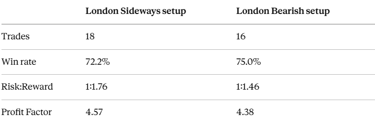
Those numbers look almost too good — and that’s exactly the moment to get suspicious rather than excited. So we stress-tested them:
Removing the single best trade (a +270 point outlier) still left a 73% win rate and a profit factor above 3 — encouraging, since the edge wasn’t entirely riding on one lucky day
Simulating fixed stop losses showed the two setups need different handling: the Sideways setup stays stable with a tight 30-point stop, while the Bearish setup needs roughly 50 points of room before its win rate stabilizes — it’s a choppier, more violent condition by nature
Where This Actually Stands
Here’s the part I want to be straightforward about: 18 and 16 trades is not a sample size you can trust yet. Standard practice wants 30–50 trades minimum before treating a profit factor or win rate as real, and ideally over 100. What we have right now is encouraging enough to take seriously — not proven enough to risk real money on.
What changed my mind about the value of this exercise wasn’t getting a clean “yes, the pattern works.” It was watching an idea survive a real falsification attempt, get refined into something more specific, and come out the other side with numbers that are at least honestly stress-tested rather than cherry-picked.
Next Steps
The plan from here:
Forward-test both setups in real time without risking capital, to build toward a trustworthy sample size
Go candle-by-candle through the winning and losing days to find an actual entry trigger or confirmation pattern, rather than blindly shorting at the New York open
Eventually layer in the Asian session as a third confluence factor, the original idea I’d parked to keep this project from sprawling before the two-session foundation was solid
If you’re sitting on a chart pattern you’ve “noticed” but never tested — that’s usually where the real work hasn’t started yet, not where it ends. Define it precisely enough that it could be wrong, then go find out if it is.
You can reach out to me if you would like me to do backtesting on your idea.
Follow me on Twitter/X:- https://x.com/abh_hai_
for active updates on trading and strategies.
I am Quant Trader with experience of 12 months. I am learning and growing as I document my journey and findings. I do Market data research, backtest and derive insights from data.