Gold, Silver, Platinum, Palladium, Rhodium: Each Precious Metal Is Precious in Its Own Unique Way
Olegs Jemeljanovs, PhD, CFA·7 min


 Some use cases of this data include:
 Quandl also provides some free sample data that you can play around within JSON format. You can access this data through API calls to:
https://www.quandl.com/api/v3/datatables/RSM/MSB/delta.json?api_key=”YOUR API KEY”
or:
https://www.quandl.com/api/v3/datatables/RSM/MSI/delta.json?api_key=”YOUR API KEY”
Quandl also provides some free sample data that you can play around within JSON format. You can access this data through API calls to:
https://www.quandl.com/api/v3/datatables/RSM/MSB/delta.json?api_key=”YOUR API KEY”
or:
https://www.quandl.com/api/v3/datatables/RSM/MSI/delta.json?api_key=”YOUR API KEY”
pip install quandl
import quandl
quandl.ApiConfig.api_key = "YOUR API KEY"
Note that you have to paste in your Quandl API key where it says ‘YOUR API KEY’. Next get hold of the Base Table, identified as ‘RSM/MSB’ and put it into a data frame called ‘data’.
data = quandl.get_table('RSM/MSB', paginate=True)
That is all you need to get access to the RSM MetalSignals Base Table.
 1. Before anything else, import the required libraries. In our EDA, we will need pandas, matplotlib, plotly express and cufflinks. If you don’t already have these installed, you can get them installed first using the pip install command.
import pandas as pd
import matplotlib.pyplot as plt
import cufflinks as cf
import plotly_express as px
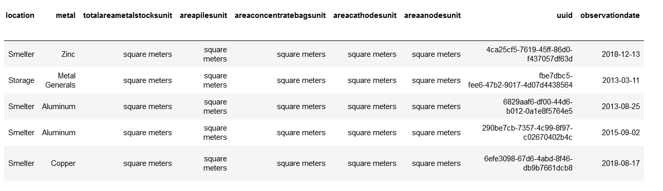
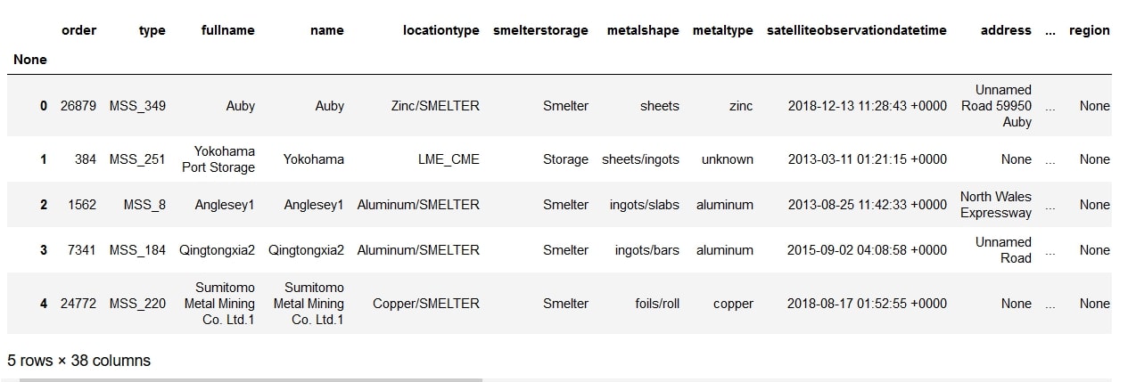
2. Next, let's take a close look at the data. We don’t want to see all the data at once, just a glimpse of the first few records or last few records is enough. This can be done using pandas .head() function. This function returns the first five records of the data set.
data.head()
 You can also take a look at the last five records using the .tail() function.
data.shape
 So now we know that our data is comprised of 27,872 rows and 44 columns. That’s a lot of columns! It probably has some columns that are not really that necessary.
 All these columns can be removed using the drop command:
data.drop(['ticker', 'totalareametalstocksunit', 'areapilesunit',
'areaconcentratebagsunit', 'areacathodesunit', 'areaanodesunit'],axis=1,
inplace=True)
 We managed to bring the number of columns down to 38.
data.info()

 We can see that our data set has 10 float, 4 integer and 23 object values and that some of the fields, like ‘country’, ‘areaanodes’, etc. have some values missing, since, the total number of records in them are less than 27872. For country, we can solve this problem simply by adding the line:
data = data.fillna(value={'country':'NA'})
This will add the initials ‘NA’ wherever the country name is not mentioned.
data.describe()
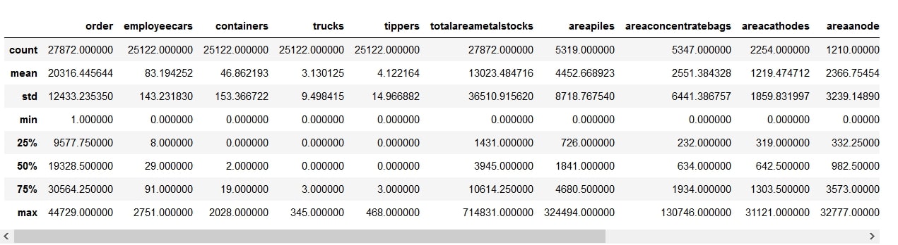 Using this function, you get the count, mean, standard deviation, minimum and maximum values, as well as different percentiles of the data. The Standard deviation (std) provides a useful means to look at the distribution of data. A high deviation indicates that the values are more spread out (flatter)...
 By looking at the mean and 50th percentile (median), we can gauge the skewness of the distribution. A very high mean compared to the median will mean that there are some records with very high values.
The differences between the 75th percentile and the max value can also inform us that most of our columns are skewed. This means that there are some extreme values or outliers in the data set.
We may need to winsorize or trim some extreme values in future, if a normal distribution is desired.
Let’s now try to visualize the data to explore further.
By looking at the mean and 50th percentile (median), we can gauge the skewness of the distribution. A very high mean compared to the median will mean that there are some records with very high values.
The differences between the 75th percentile and the max value can also inform us that most of our columns are skewed. This means that there are some extreme values or outliers in the data set.
We may need to winsorize or trim some extreme values in future, if a normal distribution is desired.
Let’s now try to visualize the data to explore further.

data.corr()
 Although this gets the job done, you can get a more visual and helpful way to look at the correlations if you combine this with cufflink’s iplot command. It is a bit more work but who doesn’t love some slick visualizations?
data.corr().iplot(kind='heatmap',colorscale="Blues",title="Feature
Correlation Matrix")
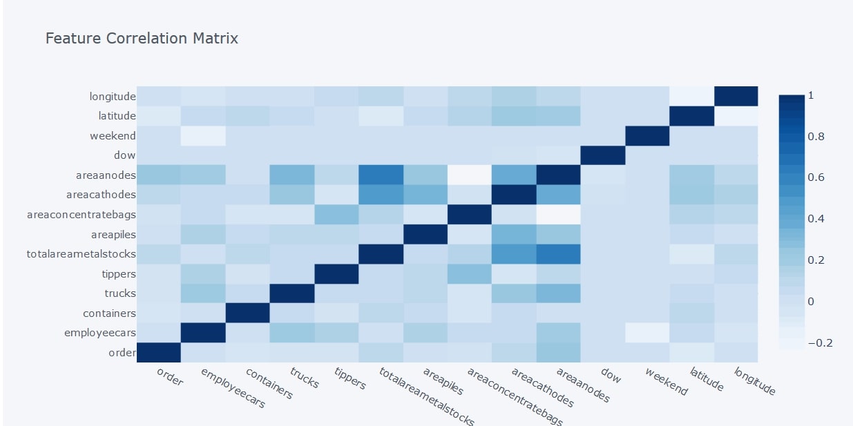 This command gives you a correlation heatmap which helps better visualize the data. The darker shades represent a higher positive correlation and lighter shades represent a lower correlation.
From the above heatmap, we can see that there is a strong positive correlation between the total area of cathodes and anodes, which makes sense because it’s the anodes that get purified to make the cathodes. There also seems to be a strong positive correlation between the total area of metal stocks and the area of anodes. The values for anode and cathode deposits only apply to copper. So the heat map tells us that most of the copper metal stocks are unpurified.
We also notice that there is almost no correlation between the total area of bagged concentrates on-site and the area of anodes, and the number of employee cars on a day does not really depend upon whether it’s a weekend or not.
This command gives you a correlation heatmap which helps better visualize the data. The darker shades represent a higher positive correlation and lighter shades represent a lower correlation.
From the above heatmap, we can see that there is a strong positive correlation between the total area of cathodes and anodes, which makes sense because it’s the anodes that get purified to make the cathodes. There also seems to be a strong positive correlation between the total area of metal stocks and the area of anodes. The values for anode and cathode deposits only apply to copper. So the heat map tells us that most of the copper metal stocks are unpurified.
We also notice that there is almost no correlation between the total area of bagged concentrates on-site and the area of anodes, and the number of employee cars on a day does not really depend upon whether it’s a weekend or not.
 The box represents the first quartile (1), median (2) and third quartile(3), in other words, the Interquartile Range (IQR). The whiskers extend to show the minimum (5) and maximum (4) values.
Let’s make a country-wise box plot of employee cars that the satellites picked up.
The box represents the first quartile (1), median (2) and third quartile(3), in other words, the Interquartile Range (IQR). The whiskers extend to show the minimum (5) and maximum (4) values.
Let’s make a country-wise box plot of employee cars that the satellites picked up.
fig = px.box(data, x="countryname", y="employeecars")
fig.show()
 Boxplots are a great way to quickly find outliers in the data too. For example, if you zoom in to the box plots for France, Japan and the UK, you will find:
 There are no outliers for the data picked up in France, just a few outliers in the UK data and a lot of outliers in the Japan data.
You can also plot aggregated values from Pivot tables. For example, say you want to see the country-wise distribution of the total area of metal stocks. You can then obtain the box plot for it as follows:
There are no outliers for the data picked up in France, just a few outliers in the UK data and a lot of outliers in the Japan data.
You can also plot aggregated values from Pivot tables. For example, say you want to see the country-wise distribution of the total area of metal stocks. You can then obtain the box plot for it as follows:
data[['countryname',
'totalareametalstocks']].pivot(columns='countryname',
values='totalareametalstocks').iplot(kind='box')
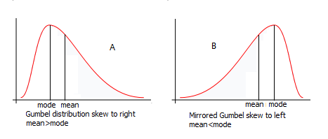
data['totalareametalstocks'].plot.density()
 This shows that the variable is right-skewed. In other words, the probability of finding larger areas of metal in the distribution is less than that of smaller areas.
df=data.loc[data.metaltype == 'copper']
We will now use this dataframe and plot the observation date along the x-axis.
We will plot the total area of metal stocks along the y-axis and display the bubbles color-coded according to country. To ensure the bubble sizes don’t get too large, we limit the maximum size to 30. The size of the bubbles will vary according to the area of copper stocks.
px.scatter(df,x='observationdate',y='totalareametalstocks',
color='countryname',size='totalareametalstocks',size_max=30)
 This allows us to see copper deposits year-wise for different countries. There is a ‘zoom’ button that plotly express provides, allowing us to zoom into certain points on the chart. Let us zoom into the year 2018-2019 and see how the numbers have been the past 3 months.
 We can see that, over the past 3 months, copper reserves in China have been increasing consistently. This could imply the global demand for copper is on the rise and hence an increase in copper price.
Another way we can visualize this data is to plot the chart according to port/region:
We can see that, over the past 3 months, copper reserves in China have been increasing consistently. This could imply the global demand for copper is on the rise and hence an increase in copper price.
Another way we can visualize this data is to plot the chart according to port/region:
px.scatter(df,x='observationdate',y='totalareametalstocks',
color='fullname',size='totalareametalstocks',size_max=30)
 This lets us identify the reserve level of an individual smelter. When combined with Global Supply Chain Relationships Data, we can predict the production activities of public companies who rely on copper as a raw material. One potential use case is to monitor the production of Tesla’s copper(key component in EV battery) suppliers to forecast the carmaker’s ability to meet production targets.
This sums up our EDA guide. In the next few parts of the series, we will form more hypotheses as well as explore the potential use case of the dataset when combined with other alternative data.
Do you have a unique idea or questions on how to use the dataset? Let me know in the comments section below!
This lets us identify the reserve level of an individual smelter. When combined with Global Supply Chain Relationships Data, we can predict the production activities of public companies who rely on copper as a raw material. One potential use case is to monitor the production of Tesla’s copper(key component in EV battery) suppliers to forecast the carmaker’s ability to meet production targets.
This sums up our EDA guide. In the next few parts of the series, we will form more hypotheses as well as explore the potential use case of the dataset when combined with other alternative data.
Do you have a unique idea or questions on how to use the dataset? Let me know in the comments section below!Dr. Jinghao Ke is the CIO of JCube Capital Partners. He is responsible for designing and executing portfolio selection using a blend of statistical, machine learning, and deep learning techniques, grounded in domain expertise in Financial Economics. He also co-founded Research Room where he specializes in using business domain knowledge, computing, smart technology and scientific techniques to create new businesses that involve data and smart technologies and improve existing organization strategies, policies, processes and structures